
Website Conversion Optimisation: A Complete Guide for the Whole Site
How to make a whole website turn more visitors into enquiries: a clear offer, trust, short forms, clear buttons, mobile speed and measurement.
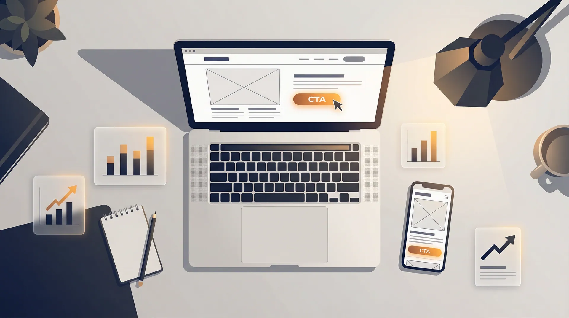
Conversion optimisation is the work of getting more of the visitors you already have to take the next step: call, send an enquiry, book or buy.
More traffic to a site that does not convert only makes the leak bigger.
This guide covers the whole site: the offer, trust, forms, buttons, mobile speed and measurement.
For a single campaign page, see our landing page checklist.
For running tests in a disciplined way, see the conversion testing framework.
What Is Website Conversion Optimisation?
It is improving the share of visitors who complete the action that matters to the business.
It combines clear writing, design, technical speed and data, so the right message reaches the right person at the right moment.
It is not a one-off project.
The site changes, the offer changes and the visitors change, so the work is a routine: find where people drop out, fix the biggest reason, measure, repeat.
Does Every Page Say Clearly What You Offer?
If a visitor cannot tell within seconds what you do and why it matters to them, they leave.
The top of the home page and of every service page should state the offer and the outcome in one short sentence, in the customer's words, not the company's.
Give each page one main action, such as "Ask for a quote" or "Book a call", and repeat it where the reader has enough information to act.
Secondary links, like "See prices", can sit lower down.
Too many competing buttons spread attention thin.
The first job of a page that should convert is to be understood in under five seconds. Clarity beats cleverness.
Which Trust Signals Make People Contact You?
Before people contact a business they do not know, they look for proof that it is real, competent and safe.
Give them that proof near the place where you ask for action.
- Logos of clients or partners, used with permission.
- Concrete results, stated as numbers you can stand behind.
- Genuine reviews or testimonials, attributed honestly.
- Visible contact details, company name and registration details.
- A clear privacy notice next to every form.
How Short Should Your Forms Be?
Every extra field costs completions.
Ask only what you need for the next step: for a first enquiry that is often a name, a way to reply and one question about the job.
Deeper questions belong in the call that follows.
- Only the fields needed for the next step.
- One column, clear labels, errors explained as the user types.
- A progress indicator on forms with several steps.
- One sentence on how the data is used, with a link to the privacy notice.
- A clear message after sending: what happens next and when you will reply.
What Should Buttons Say, and Where Should They Go?
A button should say what happens when you press it: "Book a consultation" tells the visitor more than "Submit".
Match the commitment to the stage.
Someone reading a guide may want to download a checklist; someone on a service page is ready to ask for a quote.
Place the main button after the offer, after the proof, and once more near the end of the page.
On long pages a button that stays visible can help, as long as it does not cover the content.
Is the Site Fast and Easy to Use on a Phone?
Many visitors arrive on a phone.
Buttons and form fields need to be large enough to tap, text readable without zooming, and nothing should scroll sideways.
A slow page loses visitors before they read a word; a page whose layout jumps while loading makes people tap the wrong thing.
Our Core Web Vitals guide explains how to measure and fix both.
How Do You Measure Conversions?
Define the actions that matter as key events in GA4 or your analytics tool: form sent, call clicked, booking made, purchase.
Where you can, record which enquiries became customers, so you optimise for good enquiries and not just more of them.
Then look at the path: which pages and sources bring enquiries, and where people drop out.
The biggest drop-off is usually the best place to start.
- One main conversion per type of page, such as a sent enquiry.
- Supporting events, such as clicks on the phone number, for analysis.
- Enquiry quality or value where your sales process records it.
- A monthly look at drop-off by page and by traffic source.
Where Should You Start?
- First month: measure conversion by page and source, and fix obvious leaks such as broken forms, unclear buttons and missing contact details.
- Second month: make the changes most likely to matter, such as a clearer offer at the top, a shorter form and proof near the button.
- Third month: test changes on your busiest pages if traffic allows, using the testing framework, and connect results to sales.
Conversion optimisation is not one magic button. It is a clear offer, honest proof, little friction and measurement. Improve one step at a time, decide with data, and keep the visitor and the business result at the centre. Our Conversion Optimization service starts with a free audit of where your site loses enquiries.
Want to know where your site loses enquiries? Our free audit maps the path and lists the changes with the biggest effect first.
Get a free conversion auditFrequently asked questions
How many fields should an enquiry form have?
As few as the next step needs; often three to five, such as name, email or phone, and one question about the job. Ask the rest on the call.
How do we calculate the conversion rate?
Conversions divided by visitors or sessions for the same page or path. Define the conversion as a key event in GA4 or in your customer database (CRM) so you can see it by source and page.
Should we test every change?
No. Fix obvious problems directly. Test where you are unsure and where the page has enough traffic for a result you can trust; our testing framework explains how.
What if our traffic is low?
Rely on clear fixes, feedback from customers, and session recordings or heatmaps. A/B tests need a lot of traffic to give a reliable answer, so they suit the busiest pages first.